Logotype - Introduction
The Cloetta logotype is unique and full of character. We are proud of our logotype and what it stands for. That is why we are not afraid to use it boldly in our applications. As it has so much character it can easily be placed on an empty area and stand on its own.
Logotype - Versions
Primary Logotype
Our logotype is natural red and has all the characteristics of a strong brand mark that can stand on its own. The primary logotype is always used on a natural white or very light background with clear space around it. The logotype should be respected at all times.
Download the Cloetta logotype pack here.

Secondary Logotype
The white version must be used when the background is coloured or contains of an image, still with plenty of clear space and with respect for the logotype.

Logotype - Colours
The primary logotype is in this red colour and the secondary is white.

Pantone 485 C
C: 0, M: 100, Y: 100, B: 0
R: 240, G: 0, B: 0
 |
| Pantone 485 C C: 0, M: 100, Y: 100, B: 0 R: 240, G: 0, B: 0 |
Logotype - Examples
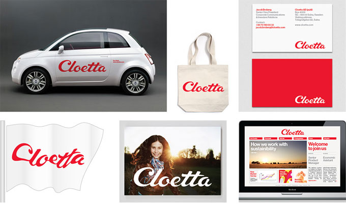
It is really important that the Cloetta word mark is visible, which means that the red logotype will always be on white background with plenty of clear space surrounding it.
It is also important that the user takes time to think about where in the design the logotype will get the most space and freedom (this is especially important when the white logotype is used on a picture background).
Composition in photographs is very important, as the logotype should be surrounded by clear space. Our logotype is our hero and the core of our identity.
![]()
Logotype - don'ts
There are some things you should have in mind when applying the logotype to different applications.
Do not put the red logotype on dark or patterned backgrounds. When the background is dark or patterned please use the white logotype.
If possible, use the logotype boldly. Let it show that we are proud of Cloetta. It will not always be possible to use the logotype boldly but if possible please do. However, do not forget to make use of clear space.

Logotype - Clear space
The clear space must be at least half the height of the Cloetta brand mark, in all directions.
