Typefaces - Introduction
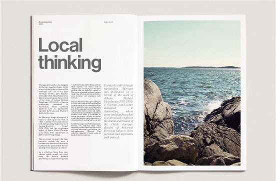
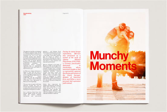
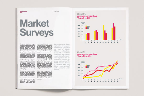
Our typography may look straight-forward and simple, but it is how we use it that makes the impact. Remember to use contrast when you layout your text or headlines (e.g. big vs. small, see examples below).
Typography is chosen to complement our logo that has a lot of character and personality.

Primary Digital Typeface - In-house & web
In our digital media we use Arial Bold and Regular if necessary, since it is similar to Neue Haas and it is a web-safe typeface.
Example of use: Arial Bold is used for headlines for productions made in MS Office or the Web, for example, in applications, such as PPT-presentations, Excel and Word documents and the Internet. Arial Regular is used for body text for productions made in MS Office. For example in applications as PPT-presentations, Excel and Word documents.


Secondary Digital Typeface - In-house & web
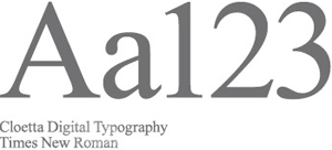
We use Times New Roman as our web-safe substitute to Chronicle.
Example of usage: Times New Roman is to be used as body text when there is a need for long sections of body text. For example reports compiled in Word and via the Internet.

Primary Typeface - Print production
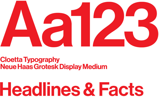
Our primary typeface is Neue Haas Grotesk Display Medium. This typeface is a newly drawn version of a timeless classic – Helvetica (Similar story to our logo).
We picked a typography that is timeless and simple to complete the personal and characteristic logotype. Depending on how it is used it can be both sharp, contemporary, driven and joyful. It ads a corporate feel to the visual identity. It must be used primarily for headlines, facts or captions.
Example of use: Neue Haas Grotesk Display Medium is used for headlines of documents drafted using InDesign or Illustrator, for example, for applications such as the annual report and other printed documents.
Buy the typeface Neue Haas Display Medium here.


Secondary Typeface - Printed documents
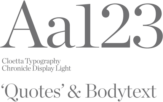
As a complimentary typeface, we use Chronicle Display Light, since it is a modern and sharp typeface that can be used in both body text and highlighting quotes.
Example of use: Chronicle Display Light is used for body text for productions made in InDesign or Illustrator, for example in applications such as the annual report and other printed documents.
Buy the typeface Chronicle Display Light here.

Typefaces examples
Headlines
Headlines can be set in red, grey and white. When creating different levels of headlines please, ensure there is much difference in font size. The different levels can also be set in the different colour, as mentioned above.


![]()

![]()
